SmartBase
SmartBase is a task management tool designed to help schedulers keep track of their assets and make sure that all people on base are qualified for the right jobs.
One of SmartBase’s primary users is the scheduler, the platform has multiple views to show events and displays who/what/where someone/something/somewhere is scheduled for a job.
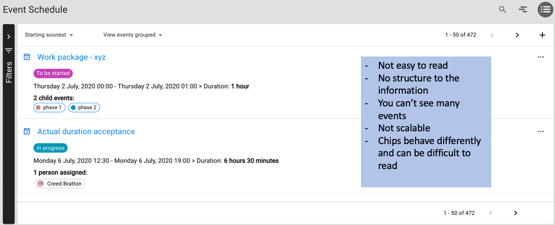
The event list view had a lot of problems, it was tricky to immediately find information and it was not scalable. When conducting research we discovered different personas required different components on their event list view, and so we decided to revisit the feature and ensure it was customisable for our clients as well.
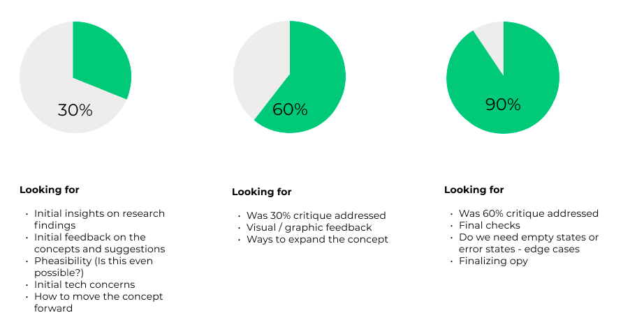
As part of this work, we implemented a 30/60/90 framework which allowed us to get stakeholders, developers and architects involved in the design process early. The 30/60/90 framework allows UX designers to share the process they have been through at 30%, 60% and 90% completion of the project. It also allowed us to gain constant feedback as we worked through each stage of the design process. Implementing the 30/60/90 framework at SmartBase became a game-changer after we tried it with this feature by improving our process and creating a good cadence for UX work. It was great to see everyone in the business get excited about each feature, feel involved in the process and have their opinions heard.
30/60/90
30%
Setting the scene
When I conducted the 30% presentation I began by showing everyone our current event list and highlighting the immediate issues. The screen shot on the right was taken on a 14 inch laptop, and one major issues that was clear was that it only was able to display 2 events at a given time on the average lap top. This view was not scalable or responsive. When we asked our customers to let us know what they thought of the current event list, they pointed a lot of flaws regarding the readability, and wanting to see even more information.
Customer feedback. The blue highlights the must haves, the orange the nice to haves.
Competitor Analysys
The UX team and I had done a competitor analysis with multiple businesses, but for the presentation we chose to focus on the two that we felt were most like our product, OpenProject and Monday.com
These two products had long event hierarchies, were able to display a lot of information and had customisable views.
Lets Miro
At the end of the 30% I showed the team this very early low fidelity wireframe. This was all I gave them, and I asked them to comment on the concept, the different columns and how they believed it would behave.
I also asked them to clarify if they felt this design resolved the 4 ‘Must have’ intiatives.
Does it display more information
Are you able to see more events
Does it display event hierarchy effectively
Is it customisable
The results were a yes to all 4 must haves :)
60%
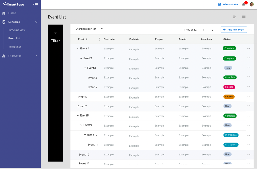
First round of visual feedback
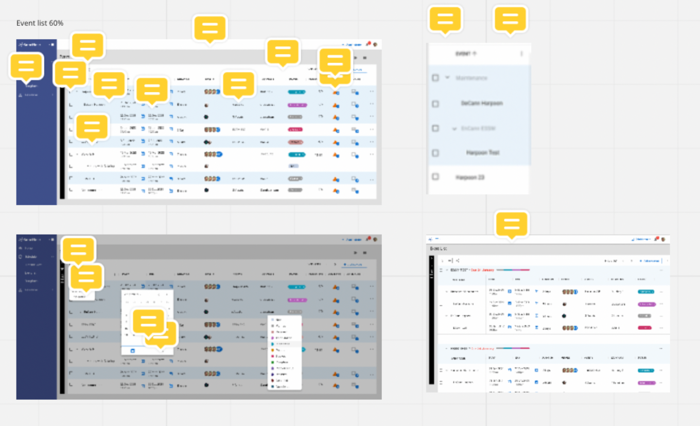
Before I jumped into the screens, I began by addressing initial feedback from the first 30%. I had arranged a meeting with the architecture team to discuss some of their initial concerns, and tried my best to incorporate some of the feedback that was given in the Miro session with the team.
Once addressed and discussed I showed the team the designs. There were plenty of elements I had not considered and so was able to chop and change plenty of elements before I jumped into user testing.
Were there existing elements we could use?
As part of the design research I also presented a live demo of the Material UI data grid, the material ui library was something well used and accessible to the team, so I wanted to see if we could use particular elements from their data table in our design, rather than custom building everything from scratch
Miro Again!
As you can see 60% always brings in a lot of feedback!
90%
The nitty gritty
At the 90% I set the scene by running through the user feedback, everyone had had their fair chance at speaking up about what they thought could be improved, so it was important to run through a bit of user testing done with people who had never seen the designs.
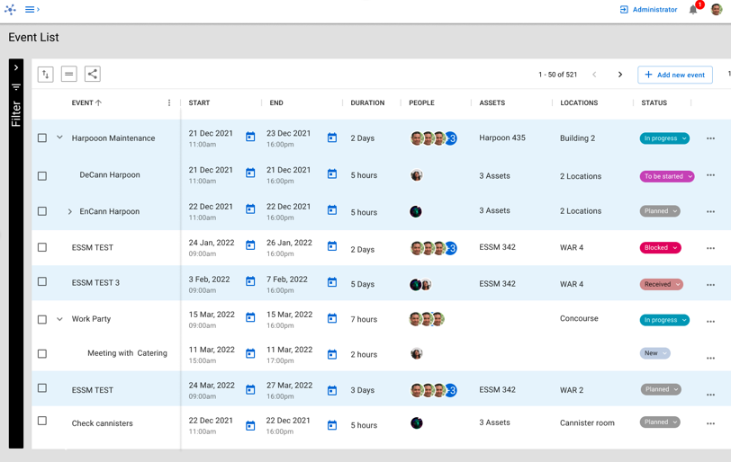
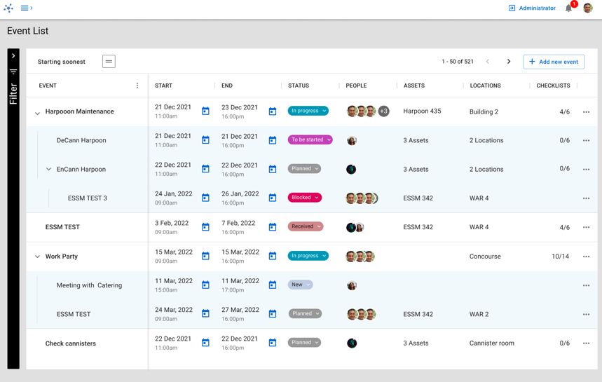
I then followed through with more refined designs, hopefully addressing any critique brought up in the 90%
Last chance to get your opinions in guys before it goes to dev!
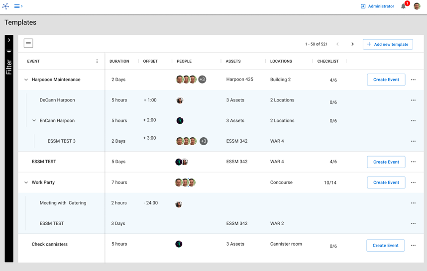
Oh and we had to carry over the design to our event template list too.
Slicing
Finally before ending the session, we discussed a quick proposal on how to slice the work for storying. We highlighted the elements we thought were ‘Must haves’ for the first cut, and also outlined the ‘Nice to haves’ for either the part 2 or if they were easy.
Key take aways
At the end of our first 30/60/90 process we had a retro and refined the process and definitions of each part just a little, we discussed what went well and what did not. Overall the feeling was that most people felt like they were involved earlier, which had been a gripe with multiple people in the business. People who had not had a chance to get involved so early now had the chance, and UX could deliver designs to developers knowing that they had given people every chance raise concerns before implementation. (NOT AFTER!)


