PEXA Design System
PEXA works with convenaycers, lawyers and banks to assist them with their mortgage/refinance matters so that their customers settle into their homes on time.
While working at PEXA the company faced many changes from acquisitions to new solutions for new customer segments. As a result we had a range of different assets and not a very comprehensive design system. Our designers were all designing differently and patterns were not clear.
After completing a Design System Bootcamp with Memorisely, I lead an experiment using the PEXA website where we could explore the use of design tokens and a new way of documenting before we implemented any new design system strategies with the other PEXA products.
After communicating my skills through the website experiment, I worked with a team to implement a solid group Design system, starting with the PEXA International team. We have documented our foundations and component specs, measured their accesibily and explored new Figma features. Let me show you how we did it.
Video walk through
Got 10 minutes to spare? Watch this 10 minute walkthrough of the PEXA design system.
The problem
Over the last few years, in the spirit of growing and expanding, PEXA had been heavily focused on delivery. As a result they had been prioritising output, speed and efficiency, over quality, consistency and scalability. This had led to designers designing differently, and no single source of truth.
The main areas we wanted to focus on for improvement were:
No single source of truth
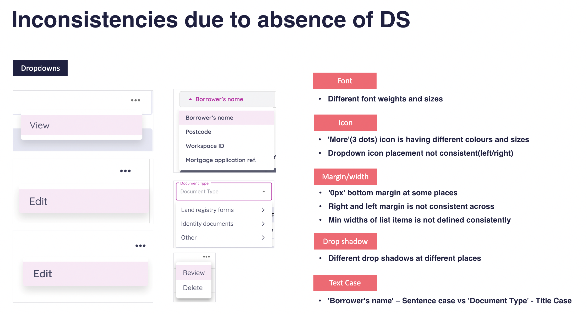
Inconsistancy
Efficiency and handover
Scale and accessibility
Auditing
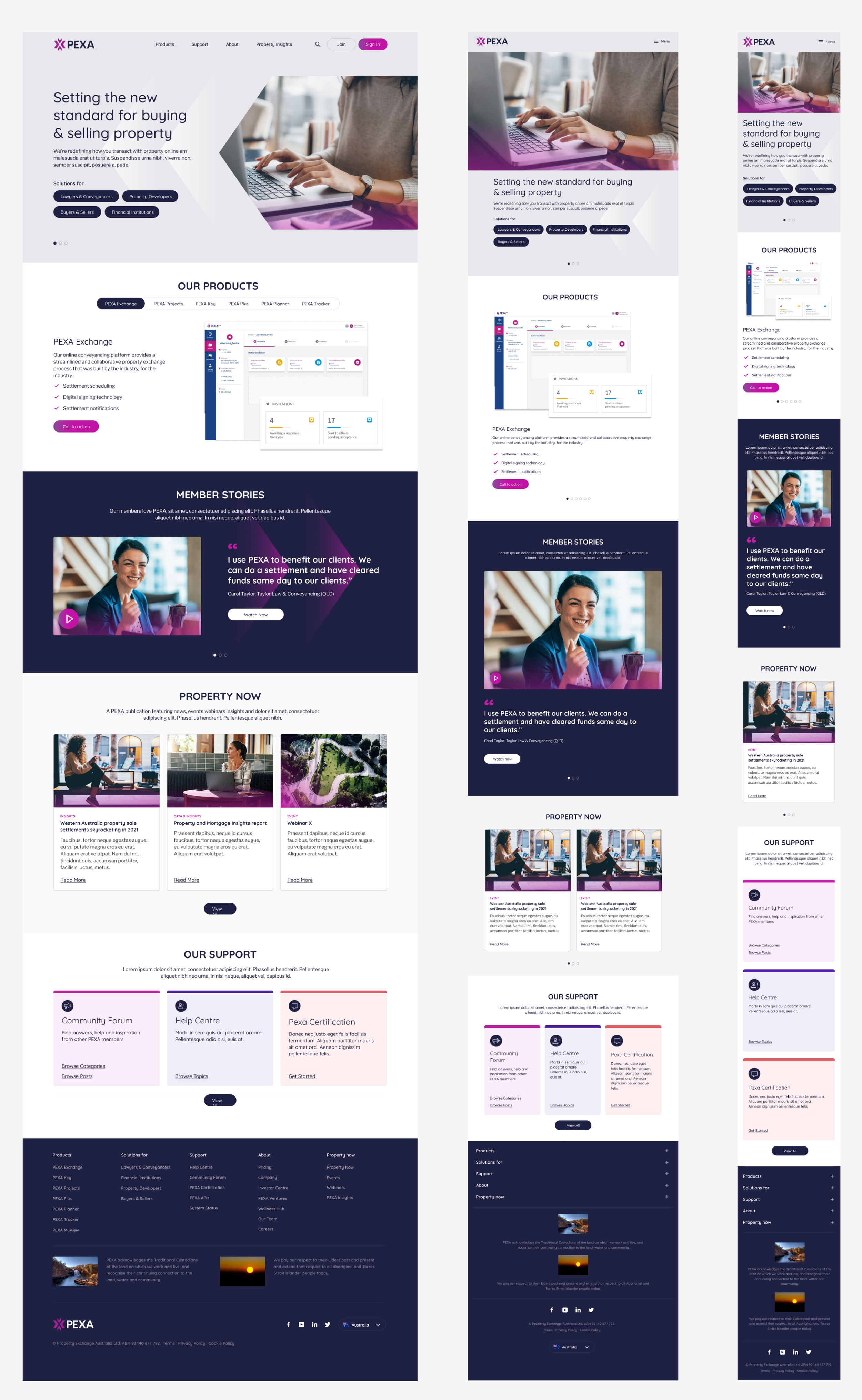
We began looking through the PEXA website and the PEXA international product to collect some inconsistencies that needed reviewing.
PEXA has a strong brand but it became clear that designers, developers and QA”s were not aligned with an understanding of when to use what where.

Foundations
We began by dividing our file into foundations and components. Foundations are the building blocks of any design system. They include colour, typography, spacing, radius ad grid. Before we could settle on any styling, we had to cross reference with our brand. Many decisions were formed from discussions on who we want to be and how we want to position ourselves.
Icons before
Icons before were inconsistent in colour, style and radius. We did an audit, cross references them with our brand and together with marketing discussed the best icon style for our products.

Design tokens and variables
The main purpose of Design tokens is to have a consistent naming structure. This ensures everyone in the team can easily reference each token with ease. Design tokens should be used across the business from designers to developers. To create the tokens I used a token plugin in Figma called Token studio.
For colours I also conducted a contrast check to ensure accessibility requirements were met
We also implemented the Figma variables feature. All of the colours were turned into variables to allow for scalability and any future theming.
Icons after
We defined and documented our new styling based on our branding guideines and messaging. The icons are now, non filled and rounded, thin and slick, and all from the material design library.


Typography before
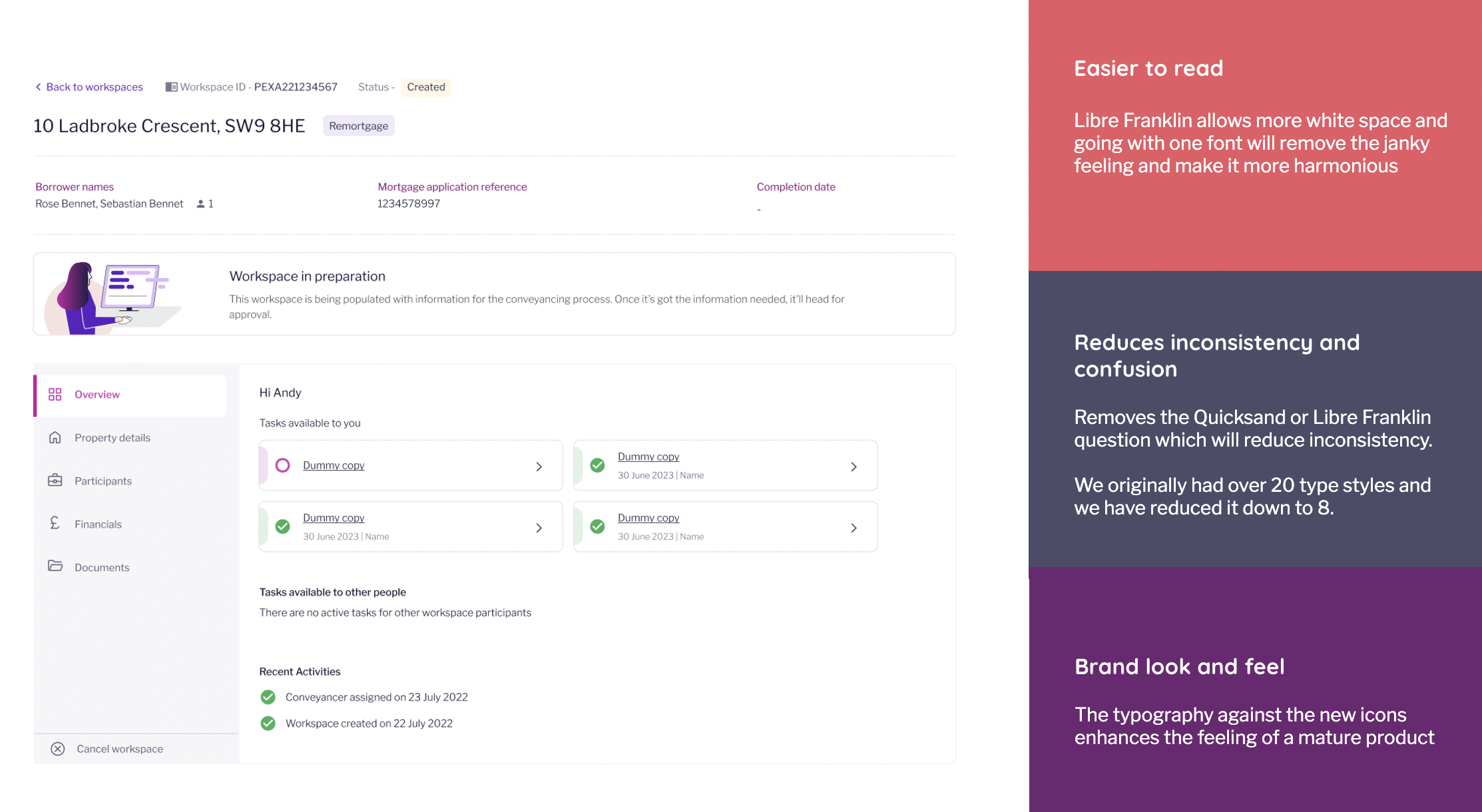
Originally, there had been a loose guide that all headers should be Quicksand and all body styles should be Libre Franklin. But when it came to our product it became clear that this guide was far too unclear, what should we use for badges, buttons and secondary navigation? It became clear that the loose guide was causing designers and developers to work differently.

Typography after
From testing it became clear that Libre Franklin was the far more readable font and more aligned with our ‘friendly but serious’ branding. We consolidated the site to be almost entirely Libre Franklin. This allowed it to be easier to read, reduce inconsistency and confustion and align with our brand look and feel.
Components
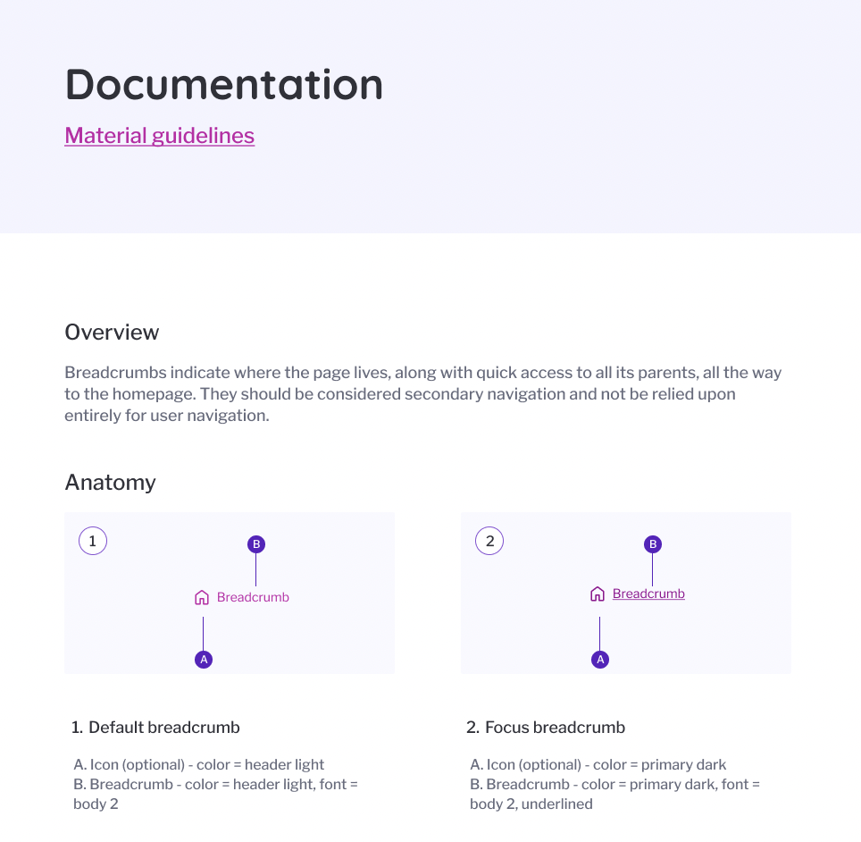
Each component in PEXA includes documentation for the specs, the accessibility and the components variants. Components use the colours and number variables we defined in our foundations as their building blocks.
Documentation
For each component we are sure to document the below guidlines
An overview of the components
The anatomy of the component
Properties the component is using
Any types (Primary, secondary)
Usage (where, when, why)
States and behaviour
Specs
Guidelines (Do’s and Don’ts)
Accessibility
For each component we are sure to document the below accesibility checks to ensure that we are WCAG AA compliant.
Colour contrast check
Touch target
Focus order
Roles
Aria labels
Alt text
Variants
At PEXA we have been displaying the variants in a table format for readability
the table is laid out depending on the properties it includes, examples include
Size
State
Hierarchy
Type
Boolean properties (True/false)
Properties
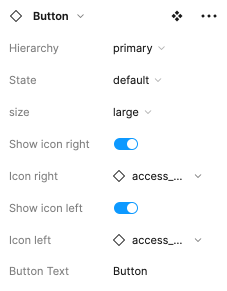
I always try to make sure that we utilise properties as much as possible so that we can create a customisabe component and not fill up our library too much. The property types we use are
Variant properties
Boolean properties
Instance swap properties
Text properties


Here is an example of how I like to set up our component properties
Scalability
To make sure that the product was scalable I ensured each component was responsive and accessible on multiple devices. I was sure to test each component at different sizes as I made them. I achieved this using auto-layout and establishing minimum and maximum withs.
Take aways
The project of helping consolidate and document the design system at PEXA gave me confidence in my design ability and helped me improve my knowledge sharing. Through the process I ran regular workshops to ensure that the other designers understood how each component was created and ensured we were aligned.
After implementation, PEXA has already seen improvements not just within the design team but also other parts of the business when it comes to consistency in our website build. This also helped to establish a solid standard for other design systems at PEXA going forward.
As we continue to improve and evolve the design system, we have implemented some front end UI developers, as well as put in place a testing cadence involving surveys and design huddles to ensure that the system is fit for purpose.
